If you’re starting a new business or going through a rebranding process, congratulations! Investing in your visual identity is a great way to improve your company’s image, online presence and build a recognizable brand that is authentic. Curious about choosing the best brand colors? Keep reading for more!
During the branding process, you’ll select colors with your professional team that will become a foundation for your brand today and in the future. While it may seem like child’s play, selecting colors has a lot more to do with science than you might expect.
That’s why we’re unpacking how to choose the best brand colors – and why they matter so much.
The History of Color Theory
Believe it or not, the study of color goes back to Ancient Greece.
Color has been investigated from both an artistic and mathematical approach, with many throughout history attempting to understand color palettes in nature, our ability to comprehend color, and even color psychology.
We know today that colors evoke feelings, which is why they are so important in the brand image we project.
When you work with a design agency, like The MMC Agency, the team will help guide you through the process of understanding the psychology of color as it relates to your business.
Ultimately, your color choice should reflect your brand and attract your customers.

What is the best color for a brand?
If you’re just getting started building your brand (or you’re going through a rebranding), you may be asking, what is the best color for a brand?
The answer is that the best color for you is one that represents who you are as a company – and attracts your audience.
Let’s dig into that a little further.
Imagine if all brands had the same color family for their brand logo design. If all brands chose similar color schemes, no one would stand out to the target audience.
But it’s more than that because different colors can evoke different emotions. If you’re a massage therapist, you probably don’t want red as your primary color. Blues and purples likely make more sense (think Hand and Stone or Massage Envy).
Similarly, if you’re starting something to do with sports or fitness, you may want to consider including the color orange!
Not sure why?
Let’s look at how colors work – and how they play a role in building a complete brand. And an effective one at that!
Blues
Blue colors tend to evoke feelings of peacefulness and serenity. When you picture a light blue or sky blue, you imagine something that feels calming. The same can be true of a more rich blue or royal blue that feels secure and safe.
This feeling of calm is why blues show up in many companies that want you to feel safe and secure, such as financial institutions and car companies (and spas).
Let’s look at a few examples, starting with Paypal.
Paypal uses complementary colors, choosing a navy blue or dark blue and a lighter blue for their color palette. As we know, Paypal customers are trusting that their money will be sent and received safely, making their blue color scheme a choice that aligns well with the brand they’ve defined.
Another good example is Ford.
Ford has a very recognizable brand identity (think “Built Ford Tough”) and is responsible for getting you somewhere safely!
Reds
Red is a primary color often associated with stronger emotions such as passion, love, and even anger. Red logos are eye-catching, and it is a bold choice when used as a primary color of a brand.
One good example of both a red and blue work together in a brand is BMW M.

As we identified above, the blue can represent safety and security, which we definitely want in our vehicles. But BMW combines that with passion, and it fits when you think about their identity as “The Ultimate Driving Machine.”
What are some other good examples of a bright red logo?
How about Target or Chick-Fil-A? Both brands incorporate red into their logo design, and both include bold, fun marketing that rounds out the brand identity. As a result of this branding – and their often adored products – both have a loyal following of consumers.
Greens
Green logos and green branding inspire us to feel harmony, balance, and sometimes youthfulness. Different hues, like in any color, can influence a brand personality differently, as can a different color combination that balances various shades and colors together.
One instantly recognizable green logo is Starbucks.
The dark green image against a bright white cup is a striking brand image for weary coffee drinkers everywhere. The target audience can instantly walk into a Starbucks to grab their favorite drink and feel relaxed and welcome, surrounded by neutral colors against a bold color green.
Lime green, just like other green color combinations, can be associated with harmony, nature and, thanks to its bright neon color, can also evoke high energy or feelings of freshness and creativity.
If you think of a bold brand that uses lime green as a primary color, you might think of Xbox. This well-known brand is definitely one that ties its brand identity to high energy and creativity. Everything about the company lets its users know that it’s here to bring the fun and the nonstop play with friends or on your own.
Orange
Orange invokes excitement and enthusiasm. And it’s no surprise that orange shows up in the brand colors of many favorite sports teams!
What’s another brand that uses orange in its brand identity?
Orange Theory (that just makes sense).

Orange Theory is a group fitness concept that combines high energy and a group setting to push others to work out consistently (and effectively) for one hour at a time.
You don’t have to look far for another brand that includes orange logos. Just think about your favorite energizing brands like Gatorade or Nike. Both of these companies are there to give you what you need to go farther, push harder and do something hard.
Can you imagine if you were doing that with low excitement or enthusiasm? That wouldn’t be much fun! That’s why bold colors tend to be used – even when competitors or others in the industry are already doing so – because color psychology works!
Purples
Purple is a color that can evoke thoughts of bravery, royalty, spirituality, and even closeness or wisdom. It’s a powerful color, but it can actually evoke sadness and sometimes frustration when used too much.
One recognizable brand that has prominently used purple in its brand colors is Hallmark.
If you think about how much the brand identity relies on creating closeness, it begins to add up for the brand personality.
Yellows
Yellow is an uplifting color in any brand palette that inspires feelings of happiness, fun, and cheerfulness.
Now, if you think of Hallmark again, adding yellow and purple together is a brilliant brand move. Not only are the two complementary colors, but they also bring together much of the brand identity.
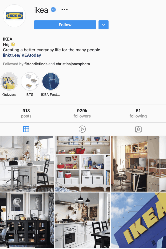
Many brands use the bright shade of yellow in their brand colors, and you don’t have to look hard to think of some fan favorites. McDonald’s, Denny’s, Snapchat, Crayola, Ikea, and more all use this fun part of the color wheel to create fun, happy brands.
Not convinced?
Take a look at the social media accounts of just a few of these brands. We’re pretty sure you’ll leave with a smile on your face! It’s part of their brand DNA.
Browns
Browns are reliable and convey strength. They’re foundational and can often be seen as solid, like the ground.
Browns may not make for the most exciting brand colors, but using brown correctly can help a brand express a strong presence.
Once you start thinking about it, you can probably bring to mind many companies that use brown in their brand colors.
One of our favorite brown brands (and tastiest) is M&Ms.
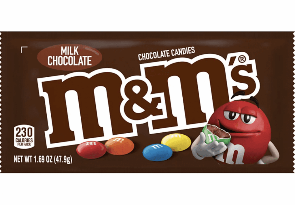
This tasty chocolate brand kept in pretty basic and let the bold, colorful candy do the talking, but there’s no doubt that the brown and white package is a crowd-pleaser.
Another brown brand that used complementary brand colors is UPS.
UPS doesn’t have exciting blue logos or clean white logos – no, they went with browns and yellows that bring together the fun of receiving a package and the reliability of a worldwide delivery system.
Blacks
Black as a primary brand color is a bold move, and it often makes sense because it is associated with power and sophistication.
Mystery is another emotion that can be tied to black. Black also appears as a secondary color or text color because it tends to be easy to read online and in print materials.
Let’s look at a couple of companies that use black logos.
Apple is one recognizable company that uses blacks and even grays for its brand palette.

Apple’s brand identity is extremely strong, and brand recognition among the target audience (which happens to be most of the population) is undeniable. But if you take a look at the color wheel Apple builds most of its marketing from, it’s black, white, and a mix of grays (or silver). This creates a monochromatic color scheme.
Apple embodies both power and sophistication, and it doesn’t feel the need to add other colors that might distract from that.
When you see different shades on Apple’s website, it’s most often the colors of their products that take center stage against the simple black logo.
Chanel is another company that has defined sophistication for decades, all with a simple black logo.
Luxury brands often tap into the mystery of a simple color choice and let the brand awareness build from the simplicity of a clean black logo against various products.
White
White colors can be seen as clean, whole, innocent, and complete.
The cleanliness of white also serves as a base for showcasing other colors that may be a part of various color schemes within the brand.
A white logo is often offset by darker logo colors such as black. That’s because darker color combinations are the only way white can be seen (since it would be invisible on a white background).
For example, Chanel, which we discussed above, is clearly recognizable when its bold black logo is placed on a white background. But the same is true in reverse when a white version is placed on a black background. This is just one example of how developing an entire brand requires multiple versions of a logo because it will be used in many different ways over time.
A great example of a true logo that is primarily seen in white is Vans.
Vans in white is place against a black background frequently but it can also be seen against the light shade of red that the brand uses for shoe boxes.
While the primary color may be white, the logo looks sharp against other colors in the color palette that help the white pop.
Brand Colors – FAQs
Understanding brand colors, color schemes, and even how to find your personal preferences can be challenging. But not to worry – we’re here to help you understand color theory a little better.
And what’s better to help you get the information you need than a frequently asked questions section?
Keep reading to learn more about brand colors and how to use them!
How many brand colors should you have?
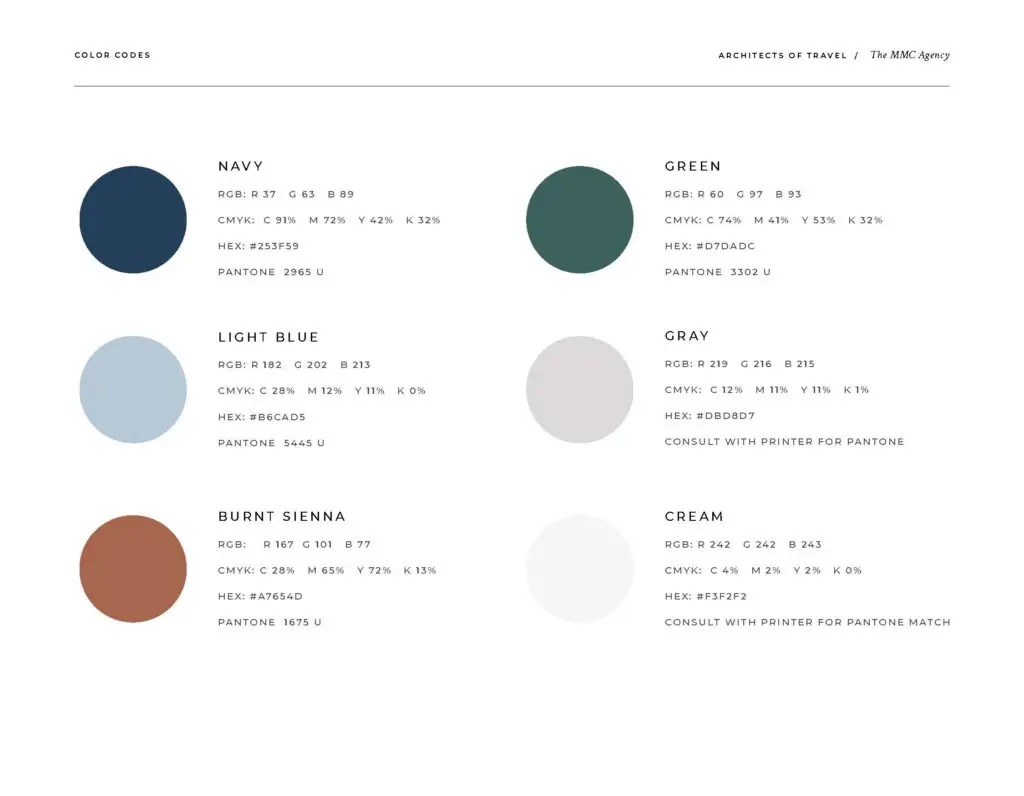
At The MMC Agency, we help our clients build their brand, and that includes creating a color palette. Typically, we include about five to six total colors, although not all are primary colors for the brand.
We begin with two to three primary colors then add secondary colors or accent colors to complete the color palette.
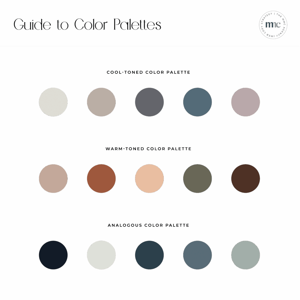
What are warm colors versus cool colors?
If you look at a color wheel, you’ll often see a break between warm colors and cool colors.
Cool colors include those that infuse energy and positivity, like the yellows and reds we covered above.
Cool colors tend to make us feel more relaxed or calm, and they include blues, greens, and the full purple gradient.
Neutral colors are just that. Depending on the complementary brand colors that offset them, they can become more cool or warm.
What is an analogous color scheme?
Analogous color schemes are not as tricky as they may sound. It simply means that the color scheme uses three colors that are next to each other on the color wheel. The result is a monochromatic look that is often very sharp and appealing.
The best way to begin creating this color scheme is to choose the primary brand color and then choose a color or colors on either side of it!
How do you use the brand colors?
Primary colors that are more prevalent in a client’s branding may be included in the company’s logo. On the website, these colors would likely show up in call-to-action buttons, photo backgrounds, and more bold content areas throughout the pages.
Meanwhile, the secondary colors are there to help ground the primary colors or, in some cases, add some depth perception, a refreshing color to the mix, or offset a dominant color.
There can be many reasons we choose accent colors to add to the visuals. Typically, it results in multiple colors that create consistency or cohesiveness when used as the complete brand color palette.
Are there any brand colors I should avoid?
There are no wrong colors, but certain colors make sense for specific brand goals.
Even if you’re entering the same industry as others that have gone before you, you don’t have to be afraid to use some of the colors you see from competitors. A brand color is only one part of a comprehensive brand.
A brand is so much more than a logo color combination. And creating an authentic, attractive experience for your audience is more important than avoiding the same colors or choosing an orange logo over the color blue or rainbow!
What do I do after I have my brand colors?
If you already have your brand colors, the next step is to build out the rest of your brand.
As we’ve mentioned above, a brand is much more than a simple logo or color palette.
A brand encompasses your values, mission, goals, logos, color palette, voice, tone, and more.
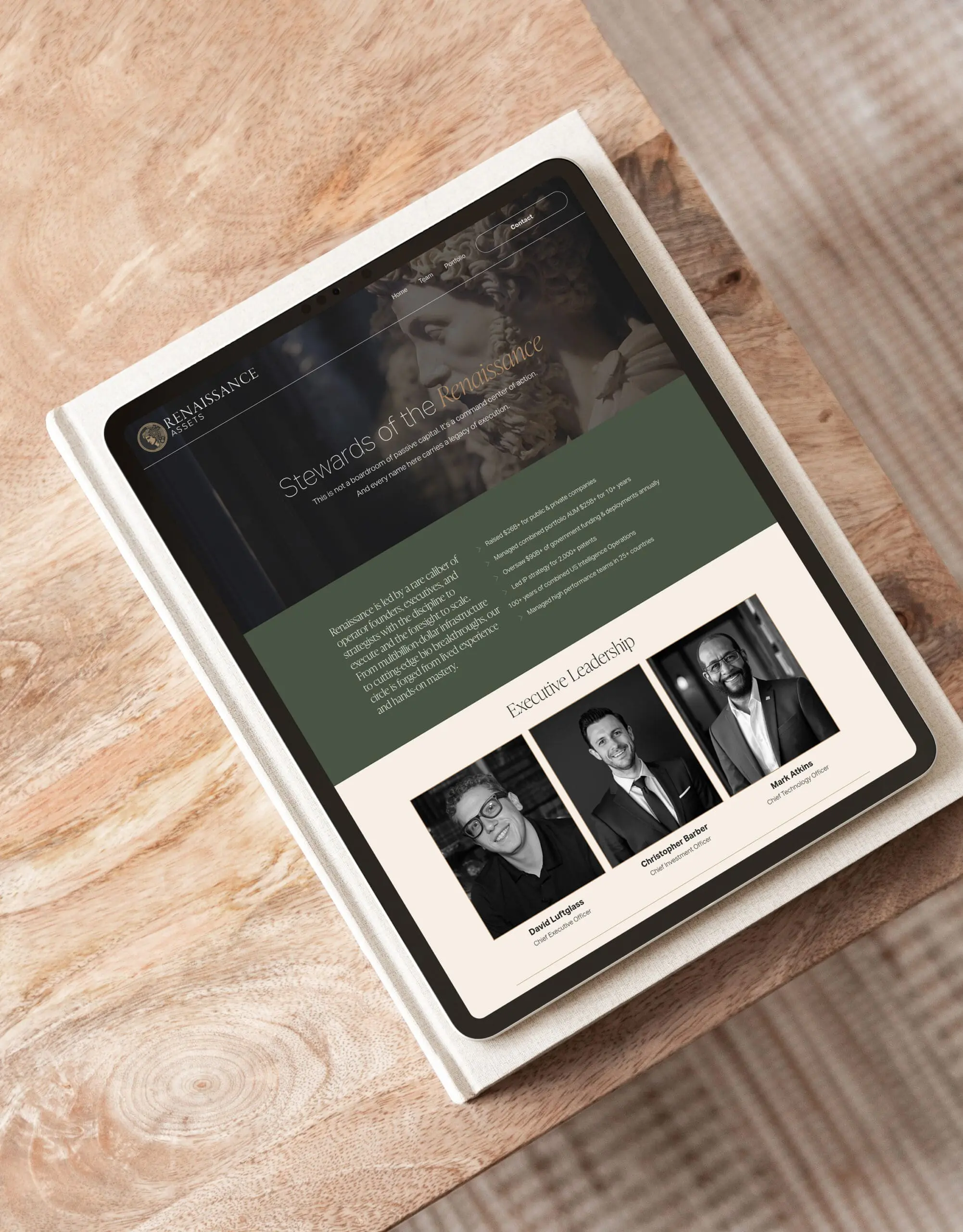
When a client works with The MMC Agency team to create their brand, our first step is to build a brand strategy. That strategy includes a color palette, mood board, font selections, and the brand’s overall vision and goals.
Once we’ve finalized these steps, we move on to logo development.
The logo process starts with initial concepts and is then refined to create the final primary logo.
You can read more about our logo process below, but once we’ve worked with our client to create a final primary and secondary logos, we create all of the brand assets to begin using on social media, the website, in marketing materials, and more.
What are Hex codes?
If you’ve used any program to create a customized file, you’ve probably seen the option to enter a color code – or hex code.
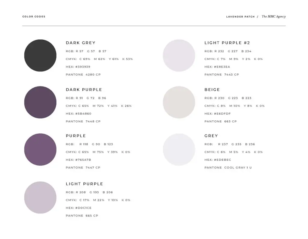
The hex code is simply a hexadecimal value that uses data to determine how much of a specific color to use to create a final color.
Each time the value of a specific color is changed, the end result changes. Believe it or not, there are approximately sixteen million different colors that can be created using these codes.
When you work with a professional designer to determine your brand colors, you will typically be given a file that identifies your brand color codes (for not only the Hex system but likely your Pantone and/or CMYK codes as well).
You can use this file as a reference for when you’re creating new files, online materials, print needs, etc.
How many logos do I need?
Many new companies may start with one primary logo – in one primary color. And while that can work initially, often, our clients quickly realize that one logo is not enough.
Why?
Because to build a comprehensive brand that will be able to compete in the marketplace, you need to build brand consistency.
That means that when you’re asked to do a presentation, you need a logo that will work on PowerPoint (whether the background color is black or white).
And when you go to update your social media, you need a logo that will work on Facebook.
What about that healthcare event you’re participating in? Yep, you need a logo that will work for your banner there too.
When you hire The MMC Agency for a brand experience, you’ll not only get clarity around your mission, brand colors, and font selections, you’ll also get an extensive collection of primary and secondary logos in white, black, and full color. This means you’ll get enough logos to work in any situation.
We understand that the logo you’ll need on social media won’t often be the same one you need for your website, but they have to both represent your brand fully so that when you see one, you instantly recognize the other.
The total number of logos may depend on your specific industry and needs.
Tech companies that have one product may need less than a boutique that plans to use logos for products, tags, packaging, signage, as an example.
On average, our projects include between 20-40 final files for our clients to use.
Do I need to work with a professional to choose my brand colors?
If you’re ready to invest in developing a professional brand, then it’s time to invest in a branding professional. That’s because choosing a brand color involves much more than just selecting something popular or that you like.
To develop a professional brand, it’s best to work with someone who understands color psychology and properly uses color within your complete brand.
At The MMC Agency, we love helping clients develop an authentic brand that works for them and works effectively to attract their ideal audience.
Our team knows how to utilize the psychology of color, alongside colors our clients like to create something truly unique and effective online and in person.
Don’t build a brand that misses the mark.
Choose an expert you can trust to help you develop a brand that will last for years to come.
Schedule a Free Consultation
Want to learn more about working with an experienced digital marketing agency?
We would love to talk to you!
Whether you need a custom brand package, complete with brand colors, font selections, logo development, and more, or everything from branding to website design & development and ongoing marketing, we can help.
Our experienced team has a proven process to help you every step of the way, so contact us to learn more.
We offer a free consultation to get started. Let’s talk!